The 9 Best Plumbing Website Designs to Inspire & Optimize Your Own
Regardless of what industry you are in, a well-structured and user-friendly site is key to dominating internet marketing and growing your business. When you take the time to build a well-optimized website that drives traffic and generates leads, you will see customers flock to your plumbing business.
Many business owners don’t know where to start when they create their websites. In this article, you’ll learn what details to include and see examples to get your creative juices flowing.
Features You Should Include for a Successful Plumbing Site
There are so many features out there it can be difficult to know what to include in your plumbing website. Some things all successful plumbing websites include are:
- Information and resources for users
- Mobile-friendly format
- Clear and engaging calls to action
- Positive reviews
- Defined service area
- Contact information
- Social media links
We’ll go over each of these elements and why they matter below.
Information and Resources for Users
When visitors come to your website, your contact information isn’t the only thing they are looking for. A quality plumbing website will offer value to visitors even on the homepage. Useful information and tips they can use at home will help win potential customers for your company.
Chances are, people have landed on your site because they want to know if you can solve a specific issue they’re experiencing. As such, your web design should include important details about your services, such as whether you offer drain cleaning, fixture installation, or entire bathroom or kitchen renovations, etc. You’ll notice this in all our plumbing advertising examples below.
Mobile-Friendly Format
The best plumber websites are mobile-friendly. 64% of all searches take place on a mobile device, and a whopping 57% of internet users say they won’t recommend a business with a poorly designed website on mobile. Your business needs to leave a good first impression, and you do that by creating a mobile-friendly, responsive, easy-t0-use website.
Clear and Engaging Calls to Action
Your plumbing services website should be a guide for a homeowner to use when deciding whether or not to do business with you. Your phone number should be displayed clearly on all service pages. Most plumbing sites place their number in the upper right portion of the page.
You should also include a call to action (CTA) for your visitors, whether it’s asking them to book a service with you, schedule a consultation, or request more details about your offers. Free consultations can be a great lead magnet. You should offer a variety of contact methods, such as text, chat, email, and phone calls, so your customers can get an immediate response.
Positive Reviews
One good way of creating trust and giving your company’s reputation a boost is to include positive testimonials and reviews on your website. Ninety-one percent of customers are more likely to use a business that has received numerous positive reviews from clients. This is why it should be a priority to get great reviews and display them on your website.
Defined Service Area
One thing all effective plumbing websites have in common is a defined service area page. Whether you offer drain cleaning, pipe installation, or sewer inspections, it needs to be clearly laid out, so your customers know what you offer and the locations you serve. Be as specific as you can about your home services, including mentioning whether you work on HVAC systems or water heaters.
Contact Information
One of the most important pieces of information to include on your plumbing website is contact details. You need to include your phone number in easy-to-see contact buttons throughout the site. Make sure to include a few call-to-action buttons that are easy to notice and spread over different pages like your home page, your services page, and your About Us page.
Social Media Links
Top-notch plumbing websites display buttons to their other social medial platforms, such as their Instagram account, Twitter account, YouTube channel, Facebook page, and others. YouTube and Facebook are still the most widely used social media platforms among adults. Most people want to see videos and images when looking at content, at least according to Sprout Social Index.
One way to make sure you do well on social media accounts is to make sure to engage with your audience. This means when they leave a comment on your posts, you need to reply to keep them engaged. In fact, more than 70% of users that have a good interaction on social media with a brand will recommend it to their friends or family.
9 Plumber Website Examples
When creating your site, studying an effective website as an example can help give you direction. It will give you ideas on what the layout should look like as well as insight into what information is most important to provide. The following plumbing advertising examples should give you a great starting point and include the elements discussed in the list above.
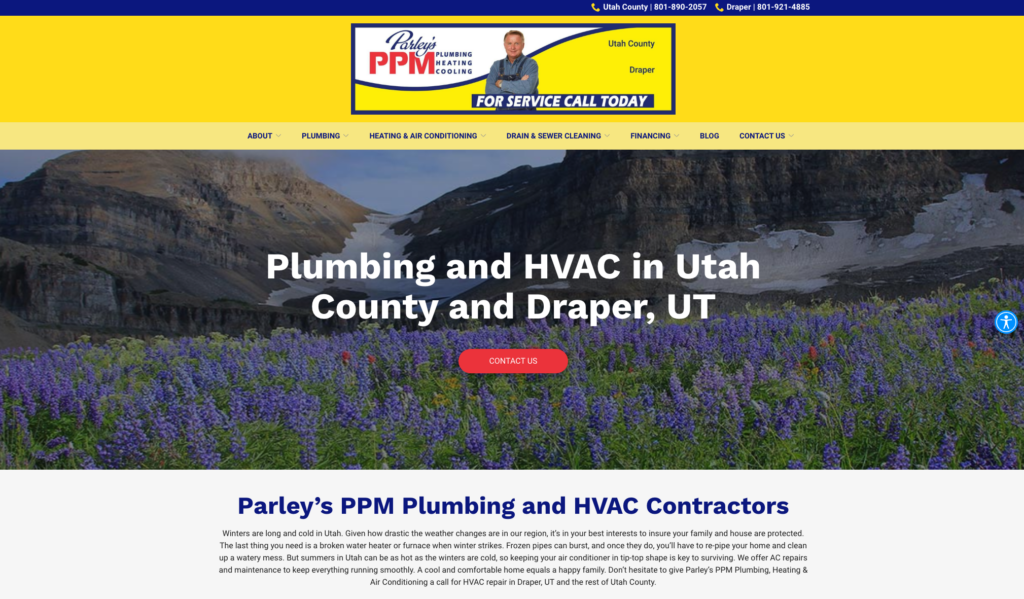
1. Parley’s PPM Plumbing
This site has prominent contact buttons at the center of its landing page. The contact details are easy to find, and the mobile version is responsive. As mentioned, mobile is important as it is the only part indexed and more than 60% of web traffic is mobile-based at this point.
Another reason Parley’s PPM Plumbing is a quality site is its FAQ page. This FAQ section not only answers possible questions your clients may have but provides valuable SEO. It also builds trust and showcases your authority.
You can easily contact this plumber through the website. It is important to remember that if a potential client has to hunt for your number, they will likely stop looking and move on to another plumber.
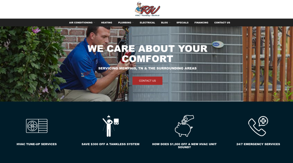
2. RW Heating & Air Plumbing & Electrical
Another site that has clear contact information displayed on the front page is RW Heating & Air Plumbing and Electrical. The site has a clearly defined section for services and is laid out in an easy-to-use manner. They also use a live chat box. This pops up, prompting you to schedule a free consultation. More than half of customers prefer a live chat to other means of communication. You should also know that more than 90% of customers feel a live chat is satisfying.
RW also uses solid CTAs on its site. These descriptive CTAs are used to get clients to take the next step in contacting them. Discounts and specials are offered right on-site. This can be a fantastic way to capture new customers. When comparing you to a competing site that doesn’t offer discounts, yours will be selected.
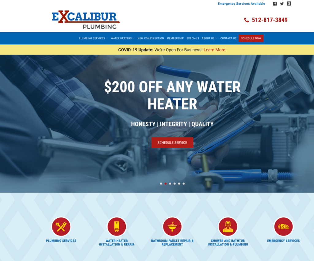
3. Excalibur Plumbing
There are a lot of effective features on the Excalibur Plumbing site. One very important feature is the use of tracking numbers. This feature gives a tracking number that changes based on how someone got to your page such as display advertising, paid search advertising, or an organic search. By allowing you to see which marketing channel gets leads, you will be able to focus your efforts more effectively.
Another effective feature on this website is the showcasing of their emergency services. Many people don’t use a plumber until it is an emergency. Their site announces they offer emergency services very clearly next to their contact number, so you can reach them quickly.
Additionally, the company tells you the reason to hire them. With all the competition, standing out becomes increasingly important. Their blurb about why you should use their services helps set them apart from other plumbing sites.
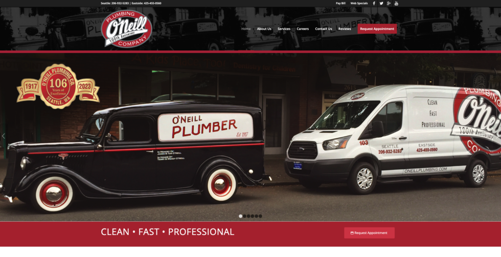
4. O’Neil Plumbing Company
One of the first things you notice is how attention-grabbing O’Neill Plumbing Company’s site is. The site clearly shows that they have been in business for generations with excellent images. It is a completely intuitive website that makes excellent use of color. The website obviously looks like it had a high price tag, but this kind of investment will pay off in leaps and bounds as it is sure to impress potential clients.
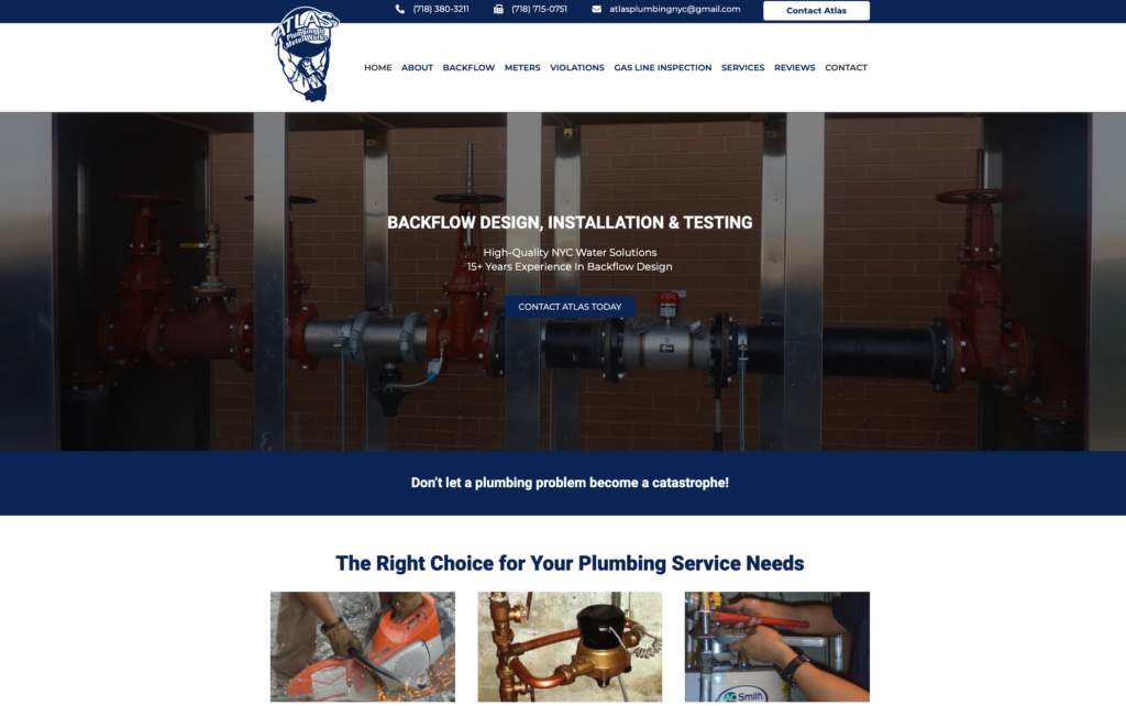
5. Atlas Plumbing NYC
Atlas Plumbing NYC has a website that is innovative, professional, and modern in its design. There is quality imagery and an interesting slider feature that showcases testimonials from satisfied clients. The site is visually appealing overall. The user-friendly design keeps important buttons for contact information within easy reach, ensuring your customers don’t get lost searching for important details.
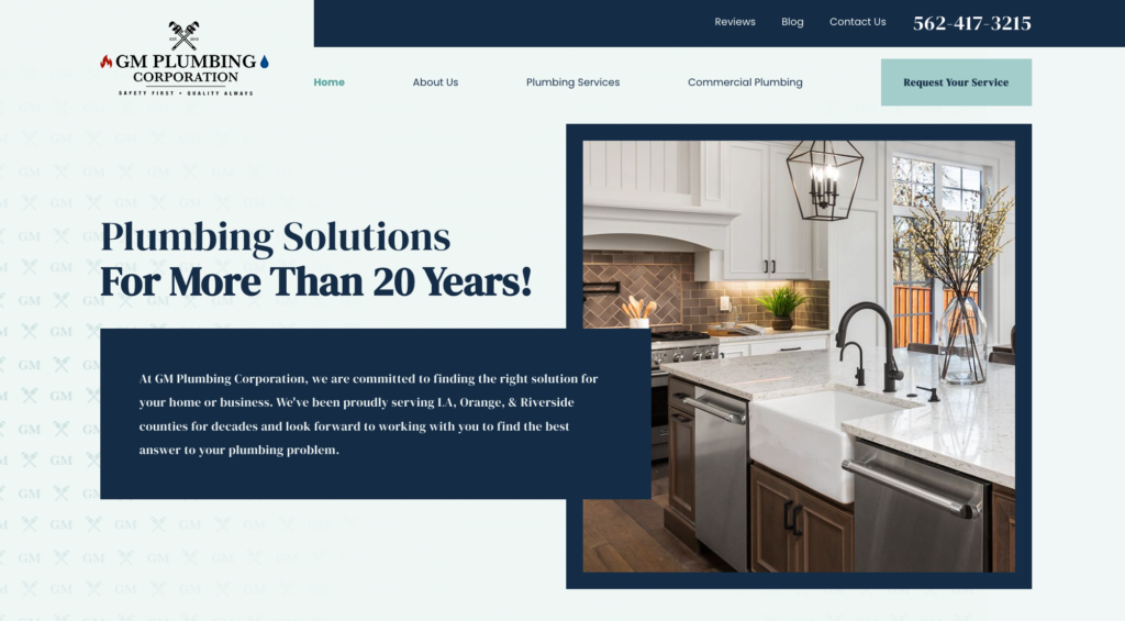
6. GM Plumbing Corporation
The website of GM Plumbing offers a sophisticated yet easy-to-use design. It ensures visitors can reach their plumbers by making sure there is a contact number placed in the header of their site. Their main services are clearly defined so customers can easily find them. The slider also offers smooth animation, multiple images, and a clear call-to-action.
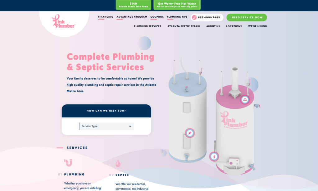
7. The Pink Plumber
The Pink Plumber is a wonderful example of a high-quality plumber website. This website makes excellent use of the color pink to highlight its services. You can easily find their phone number in the header. The site is attractive and clean, with very defined call-to-actions and attention-grabbing animation.
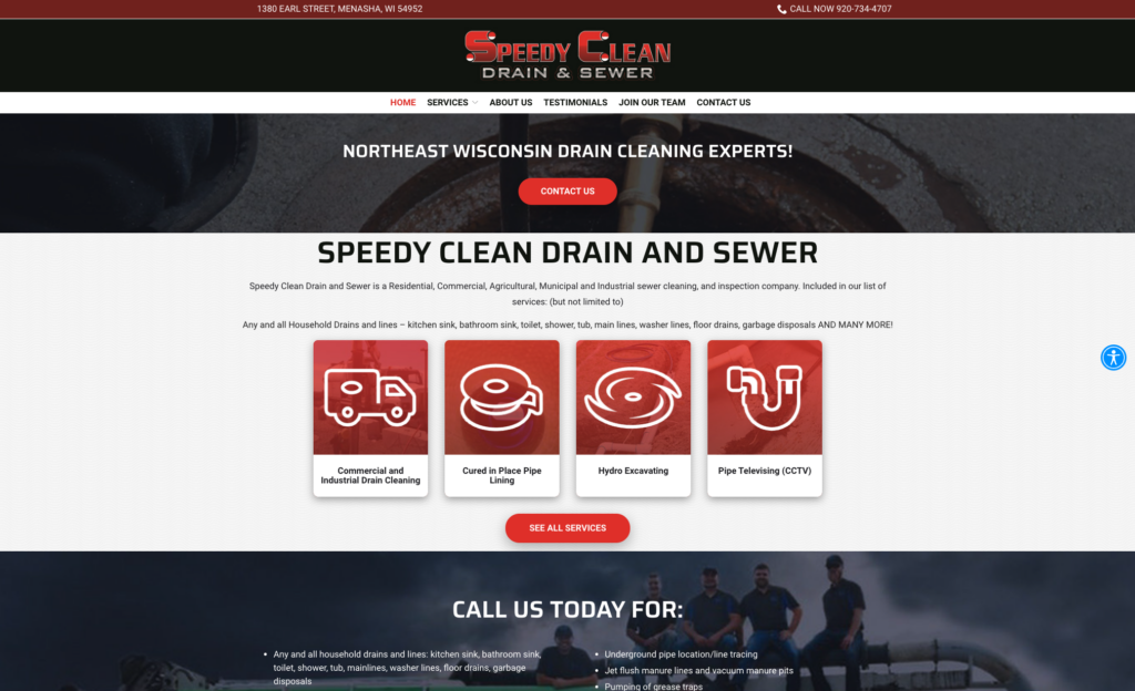
8. Speedy Clean Drain & Sewer
This is another plumbing website we love to use as an example. This is because it clearly outlines their plumbing services. Their regular and specialty services are clearly described so customers can easily get the information they need. Their dropdown navigation makes it simple to see the services they offer. Just click on the service you are interested in and learn more.
Their About Us page also has a strong design. This page describes their business, provides their mission statement, and gives you some company history. Giving your potential client a story they can connect with will go a long way in garnering their business.
Another highlight of this website is that they feature customer testimonials. It can be hard to find a good plumber and letting them in your home can be intimidating. Customer testimonials are important to the best plumbing websites because they help to build trust.
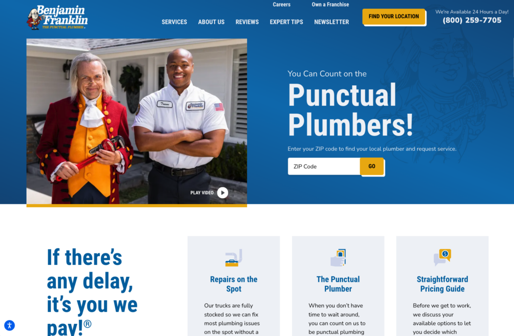
9. Benjamin Franklin Plumbing
Benjamin Franklin Plumbing shares many of its positive features with other websites on our list. The phone number is prominently displayed on the top right of the website, along with an indication that the service is available 24/7. The home page has a clear CTA above the fold, encouraging visitors to enter their zip code.
You will also find dedicated sections of the website describing the plumber’s services, offering reviews, and explaining its history. There are even tips to highlight the company’s expertise.
Grow Your Plumbing Business with Podium
Use a combination of the above examples and tips as a template to create a website that highlights your happy customers and attracts new ones. Once you have created your site, learning how to utilize it to grow your plumbing business is crucial.
There are many things that Podium can help with such as getting more reviews for your business. If you need help with making your website a conversation starter, Podium has the tools to help you with this. Podium is also in the unique position to help you utilize your customer success stories to further grow your plumbing customer base. Podium has helped many companies across different industries create more business and achieve growth.
Get started today
Ready to grow? Scale your business with an AI-powered lead conversion platform.


